2026 introduction
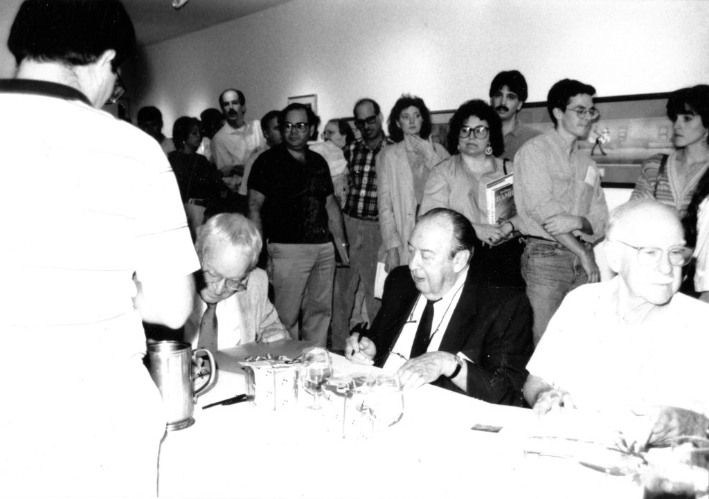
On October 6, 1990, my friends Dave Mackey, Pam Scoville, Mike Scoville, and I took the train from New York City to Philadelphia to attend an animation event at the Philadelphia Art Alliance. It included a gallery show, along with an auction full of what I remember as some of the most wildly misidentified original artwork I ever saw. But the biggest incentive to make the trek was a book-signing appearance by Frank Thomas, Oliver Johnston, Marc Davis, and Maurice Noble. They’d all worked on Bambi, the subject of Thomas and Johnston’s then-new book.
We bought copies and stood in line to get autographs. As one-third of Disney’s Nine Old Men, Thomas, Johnston, and Davis attracted most of the attention. Noble, who was more associated with the cartoons he later designed for Chuck Jones at Warner Bros. and MGM, was less beseeched by fans. After the signing, Dave and I ended up chatting with him at length. We were enchanted by the experience.
At the time, I spent most of my free time editing Animato, an animation fanzine I put out with my friend Mike Ventrella and other cartoon nuts of our acquaintance. Back home, it dawned on me that I’d love to interview Noble for the next issue. I had no idea how to reach him, but Mike Scoville did.
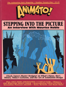
The following January, I conducted the interview by phone. Animation art collector Mike Glad generously let us illustrate it with reproductions of some of the Noble pieces from his incredible holdings. It became our cover story, bumping a tribute to Grim Natwick, who’d turned 100 and then died while we were planning the issue.
One morning at around 3 a.m., as I was putting the finishing touches on the issue in PageMaker, I suffered a minor mental crisis. I had simply run out of hours in the day to edit a fanzine, and the prospect of continuing to do so felt bleak. I immediately resolved to step down as editor, making the issue with Maurice’s interview my last. It might not be a coincidence that I shortly thereafter found my first actual full-time paying job as a journalist. (Fortunately, Animato survived my resignation and continued on into the late 1990s.)
After we published the interview, Maurice and I stayed in touch, especially after he called in late 1992 to tell me he’d be attending an animation art expo in New York and I drove down from Boston to have lunch with him. I was traveling to LA for work with some frequency and always carved off time to visit him at his home in La Crescenta. We spent many hours discussing his current animation-related projects, which included new Chuck Jones cartoons, films for Turner Animation that may never have reached the screen (I can’t remember), his own planned “Noble Tales” shorts, some surprisingly classy limited-edition cels, and speaking and consulting gigs at Disney, Pixar, and elsewhere.
The time we spent talking about cartoons was outweighed by that devoted to other aspects of life: art, travel, family, the challenges of aging (Maurice was thriving except for his eyesight, which was poor, but his wife wasn’t as lucky). I savored every moment.
We ate at his favorite Mexican restaurant and went to Chinatown together. I drove him to the Norton Simon Museum and Huntington Library, which he loved even he had to stand a few inches from artwork to make it out. We hung out with other friends of his—mainly young animation artists known as the Noble Boys. For the most part, he didn’t care to socialize with his fellow octogenarians and nonagenarians, who just seemed old to him. (Besides, he told me, Frank Thomas and Ollie Johnston had never entirely forgiven him for joining the 1941 Disney strike.)
If I’m remembering correctly, the last time I saw Maurice in high spirits and good health was at his 90th birthday party in the summer of 2000. But we had a final visit the following year in his Kaiser hospital room, three weeks before he died after undergoing an operation that he knew might kill him.
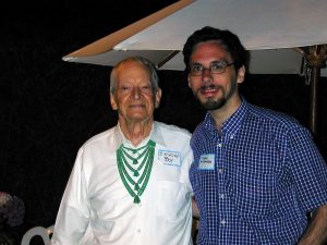
In the years when I knew Maurice, he was relishing a late-in-life renaissance as one of animation’s elder statesmen. Artists far younger than him greatly admired his work and wanted to spend time with him. I’m sure it would have happened regardless of whether I’d interviewed him for Animato. But I was deeply gratified by the fact that he considered it a significant milestone in his rediscovery. His reputation has only grown since his death, and it pleases me no end that people still care about the conversation he and I had almost 36 years ago.
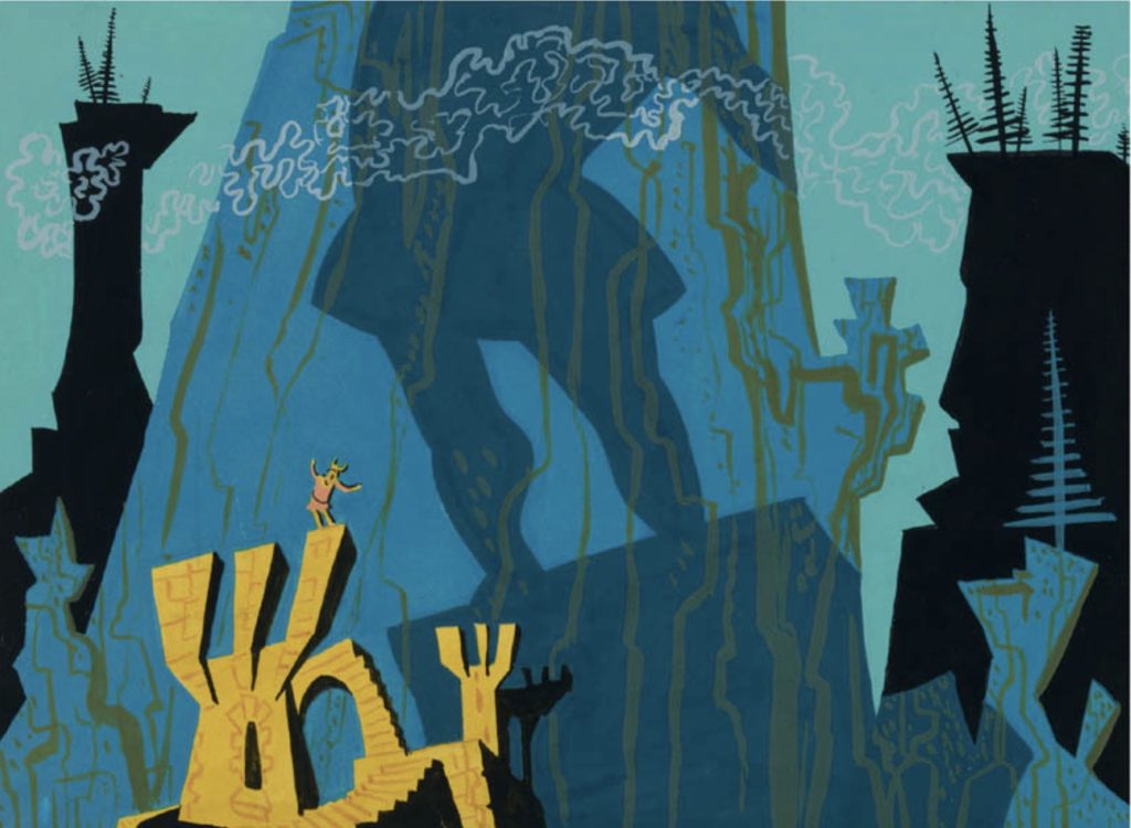
Back in 1991, Animato operated on the tightest of budgets. The issue with his interview was only our second one with a full-color cover—featuring a What’s Opera, Doc? piece from Mike Glad’s collection—and reasonably decent interior paper. To do the color separations, I used a firm in Texas that Richard Pini of Elfquest fame had recommended as doing good work at a fair price. I seem to remember them charging $375, and the framed proof is still up in my office. Inside the issue, we could barely afford to print black-and-white illustrations, which had to be screened into half-tones at about $15 per image.
(Note: While preparing this introduction, I noticed for the first time that all the other reproductions I can find of the Noble art we used on the cover are flipped horizontally from ours, with Elmer on the left. Evidently, either I or the firm that did the separations made a production error. I find that the piece reads equally well with Elmer on the right, and comes closer to conveying the opening of the cartoon. If we got it wrong and Maurice noticed, he was nice enough not to bring it up.)
I first posted the interview on this website around the time it launched in 1998. I didn’t bother to scan the art from the magazine or otherwise add any illustrations. That bare-bones page has been sitting there ever since and is still Google’s first result for “maurice noble interview.” It’s cited on Wikipedia and elsewhere and has likely been read by far more people online than ever saw it in print.
Since I republished the interview, nice color artwork by Maurice and screen grabs from his cartoons have become much easier to procure. I’m not sure why it took me so long to remaster it with better imagery, more photos of Maurice, and corrections for a few decades-old typos. Here you go, at long last.
1991 introduction
Maurice Noble’s career in animation began at Disney in the 1930s, but he is undoubtedly best remembered as the designer who made so many of Chuck Jones’s Warner Bros. cartoons from 1952 on some of the best-designed animated films of all time. Noble’s association with Jones continued into his later work for MGM and Warner’s; today, he creates serigraphs and speaks at animation studios. He also recently designed and co-wrote an episode of Tiny Toon Adventures.
I conducted this interview with Maurice Noble in January, 1991. It was edited for publication by Noble and me.
—Harry McCracken
Harry McCracken: I should start by asking you how you got interested in animation in the first place.
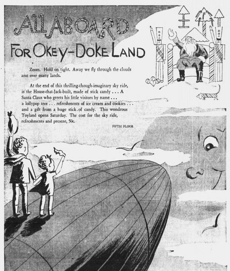
Maurice Noble: Well, I was doing design work for one of the largest department stores in Los Angeles [J.W. Robinson’s], and I had designed a children’s department for two Christmases. One of the scouts from Disney saw the work, and this scout had also known my work when I went to the Chouinard Art Institute. I think I had the first one-man watercolor show at Chouinard. I was asked to come out there and try out as a background painter, and that’s how I got into the animation business.
Had you been interested in animation before that?
No, in fact being something of a highbrow [laughs], I hadn’t paid much attention to it, although I guess I had seen and enjoyed The Three Little Pigs, which was a turning point for the Disney studios. I had never even thought of animation as a job or career. I had an attitude that it was kid’s stuff. The kiddies got down in front and jumped up and down when you put on a cartoon, but the adult approach wouldn’t be considered until the making of Snow White.
What they needed out there were people that could handle watercolor rendering for their backgrounds. I had been doing a very creative job, and designing all sorts of things from departments to all sorts of windows. I helped design the exterior of the building and all that. I went out there [to Disney] and sat down, and the first job they gave me was painting an apple with a wormhole in it. I thought, “Oh, what did I get myself into?” This was pre-Snow White. The big product at that time were Silly Symphonies. We worked on The Old Mill and some of the things that led up to Snow White.
Did you enjoy animation right away, or did it take some getting used to?
I enjoyed the work, and was hooked. It was a challenge, because at the time we were painting these backgrounds, everything was done in transparent wash, and we weren’t allowed to use any opaques at all. The Whatman paper was stretched on boards, and a pencil outline was traced. Then we were given a pencil rendering with precise detail of shadows and forms and so forth, and we had to transpose that into a color rendering. There were certain guidelines that were set up, but we would be given a sequence of three or four or five or six backgrounds that tied together. You can imagine the difficulty of matching transparent washes with different backgrounds that would be cut from one to the other.
Was this a very creative job at this point, or were you mainly doing what somebody else told you to?
It was more or less following what somebody else told me to do, because the pencil renderings were very detailed and specific. We were creating a mood, and we had to exercise our judgement in that, but we were working within a framework. Every picture must have a framework: story, visuals, and music. A total composition.
You had to work within the Disney style.
That’s right. Well, I doubt whether we’d call it a Disney style at that time. Snow White‘s style was set up for that particular picture. I suppose in a sense it was realism, but realism with an overtone of Arthur Rackham or something like that.
I worked on Snow White and Bambi, I worked on the Stravinsky “Rite of Spring” sequence in Fantasia. I had screen credit on Dumbo as color coordinator. I might have painted one or two backgrounds on Pinocchio, but not a great deal, because I spent almost two years doing sketch work on Bambi, and that overlapped into Pinocchio.
Was that more interesting work?
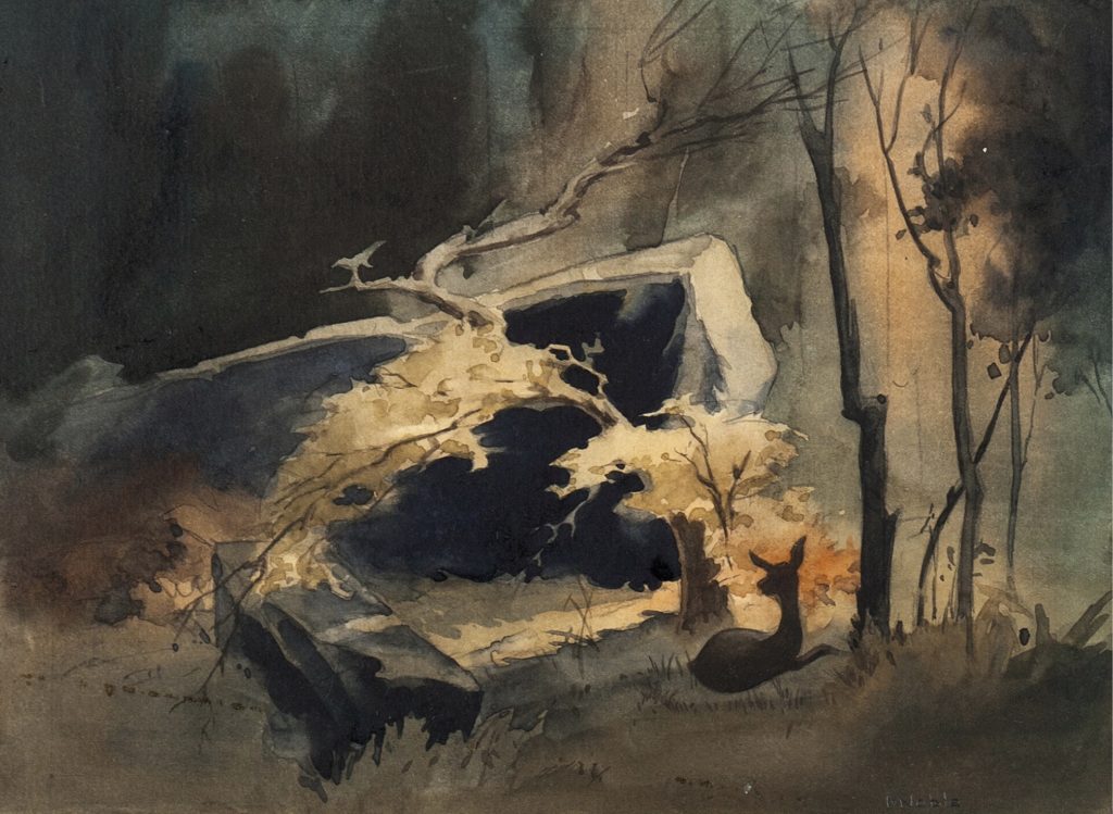
Yes, that was completely creative work. I became fascinated by the potential of the medium. I was doing thumbnail sketches for mood and continuity and so forth, searching for a way to present the picture. Originally I worked with Gustaf Tenggren, who was a well-known illustrator. I worked about three months with him, and then I believe he left the studio and went back to New York.
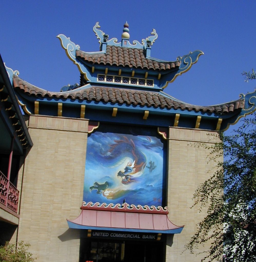
About that time they were constructing their new studio in Burbank, and the Bambi unit was shifted over to a small building down in Hollywood on Seward Street. That’s where we were isolated for almost two years. All I did on that particular picture was sketchwork; I probably did three or four thousand watercolor sketches for it. As it finally appeared, my influence was probably minimal, because they decided to go with the approach that Tyrus Wong gave it—a certain Oriental flavor, if you recall the film. My view of the story of Bambi was more on the grand scale, and Tyrus’s rendering and type of background seemed to lend itself to the intimate approach. My contributions were probably more indirect on the film.
Did you know Walt Disney well personally?
I wouldn’t say that at all—did anyone? He was kind of a law unto himself, you know. I sat in the sweatbox with him and discussed color breakdown on characters and so on. When I was working on Snow White, I had a room that was sort of catercorner over from Walt’s, and he could look over in my window and I could look in his window. I was working on the final sequence when the Prince awakens Snow White, and I’d be there sometimes to eight, nine, ten, eleven o’clock at night. Walt would say, “You still here, Maurice?” I’d say “Yes, I have a little something to finish up,” and he’d say goodnight and leave. I think the whole studio was feverishly caught up in the Snow White production. But no intimate lunches or that sort of association with him.
How did you come to leave the Disney studio?
I left there by invitation. I was a member of the group that decided that the wage structure of the Disney studio wasn’t fair, and so I went out on strike and consequently lost my job. This was a very traumatic experience: loyalty, opportunities, and finances were involved. Walt Disney set his standards high, and all credit should be given him, even though we went out on strike.
World War II was about to break out, so after Pearl Harbor I enlisted, through the Academy of Motion Picture Arts and Sciences, in the Army Signal Corps; they were asking for technicians.
Were you glad that you ended up leaving the studio?
That’s one of those moot points. I really feel I was able to be far more creative on my own, taking the route that I did. Disney has a tendency to over-refine their product, and in that way they lose a lot of their spontaneity and zip. By that I don’t mean flashy zip, but the kind of a joyful quality that I found later in a lot of the really silly things we did at Warner Bros.
Did you find that your Disney training gave you a good background for your later work?
Oh, yes. I really think the training was very valuable. I know that many of the young people in the business today work at Disney two or three years, and then they go on into the other studios. They should be commended today for upholding the quality of animation, which is not found in many of the other studios. The Disney studio still believes in drawing, which is the basis of animation.
I know that you worked on the Private Snafu cartoons during the war, so you were working on Warner cartoons several years before you actually joined the studio.
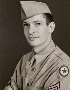
This was one of my first contacts with Warner Bros. The Signal Corps post was at the Fox studio; we called it Fort Fox. I had been down in Louisiana, and we had the Signal Corps units down there. They were organized and then moved out overseas. I was in a position to take groups of men over to the post theater to see Frank Capra’s various films, and after watching them so many times I noticed the men were responding in the same general patterns. I set up a graph and tracked responses of the men all the way through. I thought, “Gee, this is real interesting stuff,” so I sent it off to Colonel Capra.
After much waiting, all of a sudden I was transferred to Colonel Capra’s organization in Hollywood. My commanding officer was Ted Geisel, who was famous as Dr. Seuss. It was a very creative bunch: we did the Snafu cartoons, we did propaganda booklets and leaflets, we did various warnings about health problems and venereal disease, we did charts that were inserts for Capra’s films, when he was showing various battle movements and so forth. It was a very productive small unit—perhaps ten men.
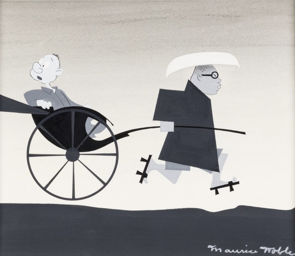
I was working on design and renderings and things of that kind. The story unit did the storyboards, and lots of times I would be called to design in black-and-white for the backgrounds. The story and the background designs were then shuttled off to Chuck Jones over at Warner Bros., and they would produce the cartoons as subcontractors.
You weren’t working directly with Chuck Jones at this time?
I was over there a couple of times, but in a sense I wasn’t directly working for him, because his layout men had to adapt our work. What I did, I assume, had some influence on the way the films were styled. As a matter of fact, I can barely recall what the films were about! [Laughs]
Oh, they’re basically propaganda. Funny propaganda, but propaganda.
Well, I remember we did one about Japan, and one about German spies, and I don’t know what else. They were all done in a comic-serious vein. They all had a message.
What did you do after the war was over?
I had some domestic difficulties and went back to St. Louis and started to do filmstrips for an organization that was indirectly connected with the Lutheran church. I worked there a number of years. One day I got a call from Johnny Burton back at Warner Bros., asking if I’d like to have a job doing layout for Chuck Jones. I said, “Confirm it with a telegram and I’ll be there.” So that’s how my wife and I came back to California, and subsequently I worked with Chuck for almost twenty years.
So you came in and out of the animation business a few times over the years.
Well, I was in the filmstrip business, but I was always involved with film. Oh, and I worked at the John Sutherland studios for a time. Warner Bros. closed its studio at one time [1953]; I, not knowing that the studio was going to close, took a job at Sutherland because I couldn’t get a raise. I happened to leave the week before it closed; I didn’t know anything about it, and everybody accused me of having inside information.
Sutherland was going to do a very important picture for U.S. Steel, and I was asked to come over there and design it. It was a film to inaugurate the large stainless-steel dome at the Pittsburgh amphitheater. We did the history of steel; I designed it and Eyvind Earle painted it. It was a fine picture. While I was at Sutherland, we made one of the first films on cancer research for the Sloan-Kettering Cancer Institute in New York. We did some films for insurance companies. I remember one time I met John D. Rockefeller, Jr.; we must have been doing something for Standard Oil. It was a very interesting, top-drawer type of operation.
When you started with Chuck Jones, did you know right away that you had a job where you’d be able to experiment and do interesting things?
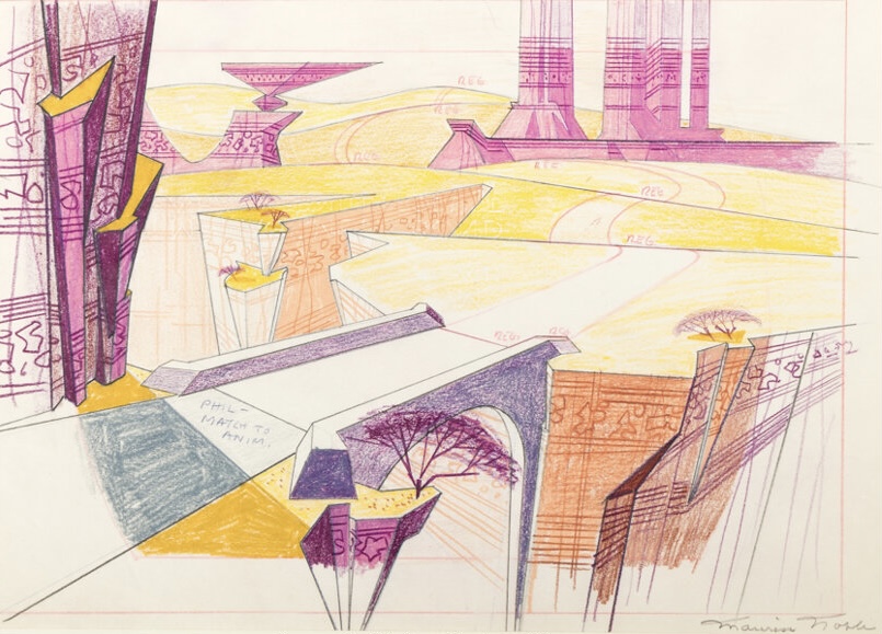
I guess I just kind of grew in the way I handled things. I’d always had in the back of my mind that super-realism in the backgrounds behind flat animation was not the right approach. So when I got the opportunity, I started to place more emphasis on shapes. I started to leave off the airbrush and create the spaces by shapes instead of a lot of fussy shadows and so forth. I tried to create each frame to support the action, and not clutter up anything or interfere with a gag or bit of action. The style just evolved little by little. Chuck was an inventive director, and in retrospect I wonder how the heck we got away with a lot of the things we did. On the other hand, as long as we turned out those Road Runners and Bugs Bunnys and all the various things that were our bread and butter, once in a while we could get in a What’s Opera, Doc? or Duck Amuck or some of the more outstanding pictures.
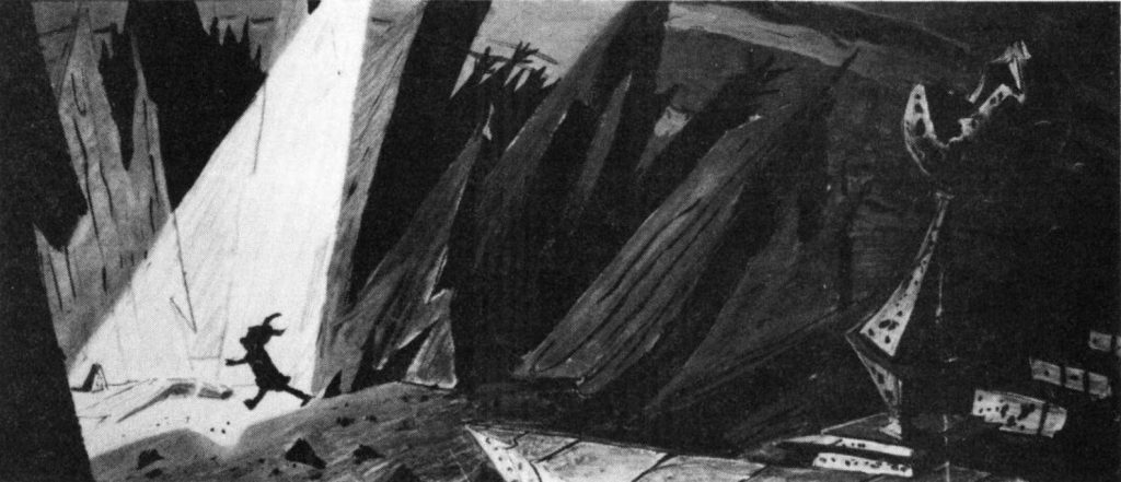
I am a great believer in the idea that color and visual impact have a lot to do with the response of the audience. I would play for dramatic impact in both design and color, in terms of putting over a story point. No background is any good unless it’s appropriate to the given situation or mood of the thing that’s being portrayed. I think in terms of Claws For Alarm, which is one of my favorite pictures, in which we did that old haunted hotel. A lot of dramatic shots and color were used to enhance the mood in that. Boyhood Daze and From A to Z-Z-Z-Z, the Little Ralph [Ralph Phillips] pictures, were sophisticated, useful approaches to design, simplified and supporting the young spirit of the films. In What’s Opera, Doc?, I did the sketches and Chuck built back into them. I quickly did away with the proscenium arch and everything, and let the audience move right in on the picture almost immediately. Then I treated it as super-grand opera and satire. It was kind of a tour de force.
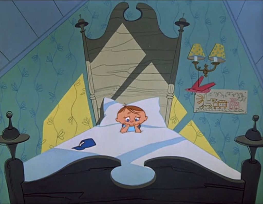
Did you realize that you were working on a film that would come to be regarded as one of the best, if not the best, Warner Bros. cartoons ever made?
As it went along, I was aware that something was kind of happening. I put in a lot of innovative ideas, and I would get calls from the ink and painting department saying, “Now, you don’t mean to say you’re going to paint this character all red?” or something like that. I’d say, “Yes, that’s the way we want it.” And Chuck was backing me up on it. As we sketched and designed and put this thing together, when we finally got it, it was just one of those things that came off. It could have been a pudding.
This is one of those strange things about doing something creative: you take a big chance, and I suppose I could have been put out the front door if it had fallen on its face. But Chuck backed me up on it, and we have What’s Opera, Doc? today. I still get a boot out of just watching it.
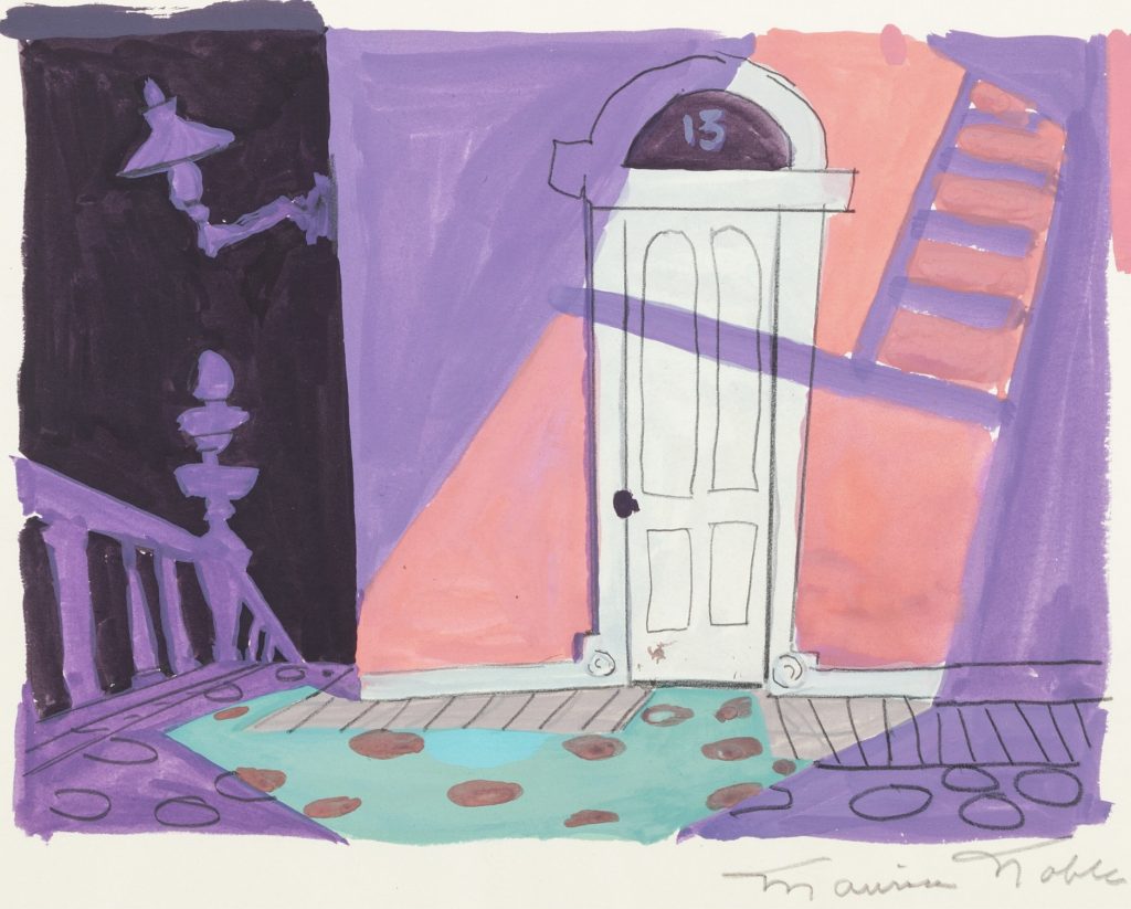
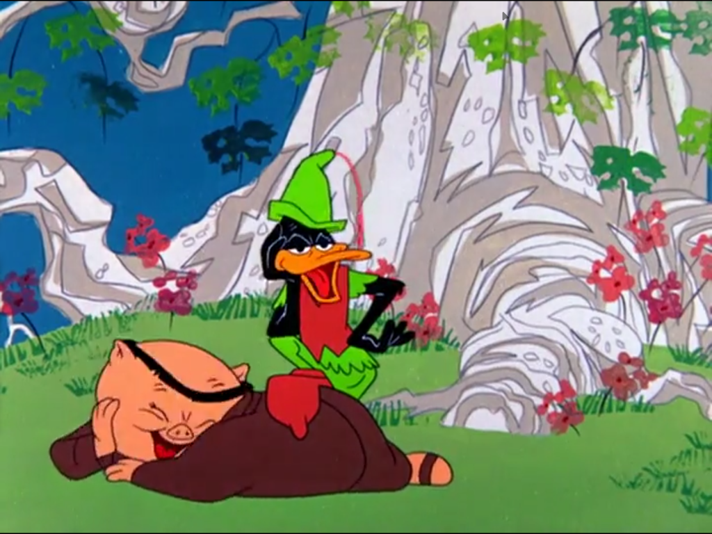
One of the things I find interesting about a lot of the films you worked on with Chuck Jones, especially during the late 1950s and 1960s, is that the graphic style is radically different from film to film, depending on the subject matter. What’s Opera, Doc? looks like no other Warner cartoon, and neither does Robin Hood Daffy. The Bugs Bunny cartoons that featured Witch Hazel have a look all their own, and so forth. That’s not something you see in the works of other directors—were you consciously changing your style?
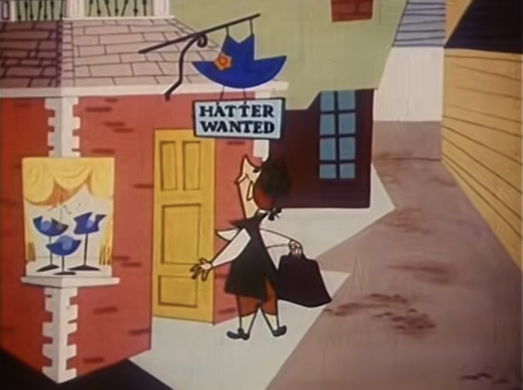
Oh yes, this was very deliberate. I was trying to shape the style to fit the cartoon. The zany quality of Witch Hazel immediately suggested a zany approach: cupboards painted on the floor and up the wall, and so forth. She was a marvelous character, and certainly wouldn’t be in a normal setup. The same thing would hold true for Robin Hood Daffy, which was a slapstick Robin Hood. I hit on this free, fun style to support the free and fun slapstick quality of the film. I think one of the great moments of animation is that line when Daffy is sitting on Porky’s lap, and they’re laughing and laughing and laughing, and all of a sudden Daffy says, “How jolly can you get?” It’s timed beautifully, and I look back on that as one of the great spots in animation.
I call it stepping into the picture. You look around and say, “Gee, what’s this all about, and does it feel right for this given picture?” And then you go ahead and design from that standpoint. I’m not particularly aware that this is my style. This is the way it happens as I design and draw a picture. It was a conscious seeking after something that I thought would support the mood of a given picture.
So you were more interested in adapting to what was needed than forcing your style onto a cartoon.
Oh, absolutely, because I don’t believe that any cartoon is successful when you force a design onto it. I think that this was one of the problems with UPA: they overdesigned. I talked to one gal who worked over there, and I said, “Gee, that was an interesting picture, but what was it all about?” And she just said to me, “Well, I had fun.” This is not communicating the spirit of animation to the audience.
Were you influenced by UPA at all? I think animation fans tend to think that UPA influenced everybody with their stylization in the 1950s. Or were you moving towards being more stylized anyway?
I’ll be very frank and say I don’t believe I was influenced by UPA at all. I did my own thing. In fact, I refused to go over to UPA; I preferred to stay working with Chuck at Warner Bros. I think UPA outsmarted itself in overdesigning and being kind of smart-assed. In a sense they were walking in their hallowed artistic halls.
I think I can honestly say that I’ve never designed anything that I didn’t think was going to communicate to the audience. After all, you have to have an audience. I’m not downplaying some of the good things. I think that Hubley’s Moonbird is one of the charmers of the animation library. But if you ask me what films do I remember that they did at UPA, I can’t really recall one.
Well, people remember Warner Bros. cartoons a lot better today than they recall UPA’s.
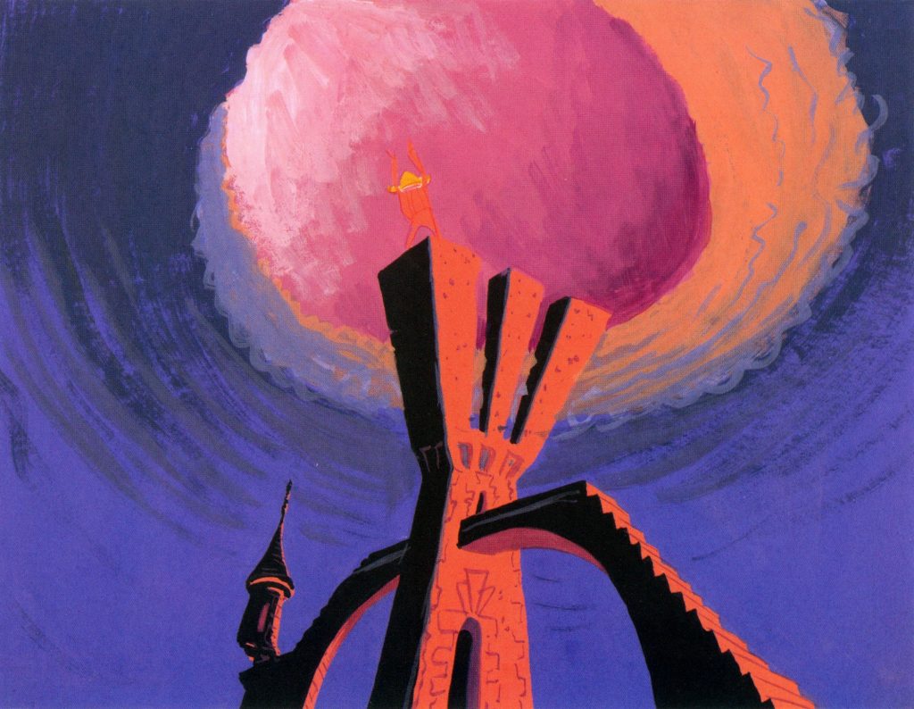
Oh, yes. They’ll say, “Did you work on Duck Amuck?” or “Did you work on What’s Opera, Doc? “or “Did you work on those Road Runners?” or “What about that thing with all the mice in the hotel?” They remember the strengths and the fun of the Warner Bros. cartoons.
I can’t think of any director other than Chuck Jones when he was working with you whose style changed so much from film to film. That wouldn’t have happened at Disney.
I think that in the Disney mechanism, they’re tied into the ghost of Walt. It’s a fanciful realism. They’ve created a lot of beautiful pictures, but that’s their way of doing it.
Did you especially enjoy working on some of the more abstract pictures you did during the 1960s, like High Note, Now Hear This, and then later The Dot and the Line over at MGM?
The Dot and the Line was built on Norton Juster’s book. The adaptation of it tried to stick very close to the dialogue and development, but to put that over into moving graphics was a real challenge. I think we got a good picture out of it. I just consider each picture a challenge. If it calls for abstract, okay, let’s go abstract. If it calls for sentimental, let’s go sentimental. I think this is what good design is all about.
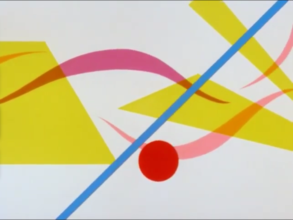
Did you feel like you were drawing on artistic traditions other than animation? I think you told me you felt a special kinship with Matisse.
Somebody asked me, “Who is your favorite artist?” and I said Leonardo da Vinci. They were kind of aghast. But when you think about it, here is a man who was inventive, who could draw, who had a sense of color and drama and composition. He was really ahead of his time in terms of so many things.
I can’t say that any particular artist directly influenced me. You take in a lot of material, and then your subconscious takes over. I really do believe that the designers and people who have worked with animation have created their own genre of art. I’m not trying to take any credit, but I really think we were innovators. We were designing in terms of length. All these other designers and painters were designing a composition in terms of a static viewpoint, and we were teasing the eye with the way the color and the actions and the accents happened in a continuity on the screen, so in the end we got a total composition. This is something that had never been done in the graphic world before.
There is a very definite relationship between animation and music. One entertains the eye, and the other, the ear. Both touch the emotions.
Was there a character or series that you enjoyed working on most?
I enjoyed working on the Little Ralph pictures, because I thought they were gentle, imaginative, and tender little pictures.
Was there a reason why there were only two of those?
I don’t know about that. Whether that’s the sum of what Chuck wanted to do with him or somebody put their foot down, I don’t know. In the chain of command, one never knows. Chuck did a couple of things with the Three Bears, and I heard the story that it was previewed up at Hearst’s Castle; he had a theater up there and a bunch of guests. Somebody announced that “Now we’re going to have a cartoon about the Three Bears,” and some dodo gal up there said, “Oh, not another story about the Three Bears.” This got to Warner Bros., and they said to never make another Three Bears story.
Were you at Warner Bros. up until the time that the animation studio closed down?
Oh, yes. As a matter of fact, I was there after Chuck left. We did The Incredible Mr. Limpet, and I was designing and Phil DeGuard was painting backgrounds, and Friz Freleng and Hawley Pratt were doing a lot of the directing on the animation. I remember working with Johnny Burton, Jr. on the wonderful matte shots that he did. Considering the almost primitive equipment that we had at Warner Bros., it’s a marvelous job of matting of the live action and the fish.
That was during the last days of the Warner animation studio. You must have gotten back together with Chuck Jones fairly soon after that, since you worked together at MGM.
I was there with him when he started up with Tower 12, which became the MGM [animation] studios. We did The Phantom Tollbooth, The Bear That Wasn’t, The Dot and the Line…
On some of those films and the later Warner Bros. cartoons, you were credited as Chuck Jones’s co-director. Was that because design had become more important, or had your role in production changed?
Lots of times, the credit of co-direction would show up and I wouldn’t even know I’d been given it. I would go in and check the animators, maybe sit in on a recording session. I was just all over the place, kind of pulling things together, ironing out a lot of spots while Chuck was going ahead with the next picture. I really don’t recall a role as co-director. Someone called me the catalyst.
I think you told me when we were talking before that you feel the role of the layout artist has changed in animation in recent years.
This is what I’ve observed, from what little I’ve been back in the studios. A rough sketch is made of the background, and the layout man in a sense is the animation layout man. He just turns the animation with a rough layout over to the background person, and they paint a background. I suppose it gets some okay somewhere along the line. The person who designed the picture doesn’t have control over how it looks, which I think is a great loss.
If you’re designing a picture for mood, you have to follow through on the thing. That’s what I’ve always insisted upon when I’m working on a picture: if I’m designing it, I’m going to see that that’s the way it gets on the screen. Their present mode of operation is one of such rush. Produce it and get it out, and jump on the next one. How do you do three stories in a week, like some of these studios do? Their pride in a picture is almost lost.
You were lucky that you didn’t have to do that many films a week. You didn’t need to do sixty-five episodes a year.
Listen, we did an appalling amount of work. [Laughs] Chuck and I produced eleven short subjects a year, but think of the amount of work that went into that: story, character sketch by Chuck, and my design work, and all the animation and ink and paint and dialogue and music scoring and sound effects. That was done for eleven pictures a year by a small crew: there was Chuck Jones, Mike Maltese, myself, Phil DeGuard the marvelous background man, and I think we had three animators and three assistants. Ten to twelve people producing all these short subjects.
It must have been a lot easier to keep tight control over the look of a cartoon when you worked with a small crew like that.
Not only was one able to keep more control over it, but there was also the esprit de corps and the spontaneity of the thing that made these Warner Bros. cartoons what they are. They’re considered the fun classics. Our input was important, and we felt responsible and proud of our work on them. It’s what I call the interference of the walnut desk with the creative process at the studios today. They want this character or that character because they’re going to make a plastic doll out of it. Consequently, this is worked into the story whether you want it or not. Inexperienced people are sitting up there behind that walnut desk making decisions on the pictures, and they’re really not the creative personnel.
I’ve not only experienced it myself; I’ve gotten this from very talented people, at the Disney organization, and other organizations too. They’ve put the cart before the horse, and I think it’s resulted in some instances in a very low-grade, semi-animated cartoon. These pictures are going to kill off the industry. There’s no in-depth analyzing a character to even develop a personality. It’s smash, bang, boom, crash. The cartoons today dote on violence and an almost cruel sense of humor.
I’m kind of on my soapbox regarding this. By cluttering it up with a lot of fast, fast, fast gags, they make people think they’ve seen something, and they really haven’t. There’s no time for development.
Do you think there’s room for good work in the kind of limited animation that’s done for TV today?
Yes, I do. I think one of the really big successes is the Charlie Brown series done by Bill Melendez. This animation is certainly limited, but look at the charm of the things. I think one of the great moments of animation history is when Linus reads the Christmas story on the Christmas program. I watch it every year, and I get a lump in my throat every time. It’s so utterly charming and direct and simple: simple staging, simple dialogue, the tone of the voice. And this is very simple animation, but it’s the way it’s done, and it’s in character with their voices and what they’re doing. Let’s just say they have “love.” This is one example of limited animation being done in an appropriate way.
I think the Europeans in some of their films succeeded in doing it; I think back to a Yugoslavian thing called Ersatz. A great design thing, but in a sense it’s almost limited animation. It’s the quality of thought that goes into the thing. It’s the quality of approach, and dialogue, and story construction. There’s no cartoon unless you have a good storyline.
And good characters.
Good characters, well that’s right. If you have a good character and you build a good storyline around it, then you have a cartoon. This is one of the things they did at Warner Bros. I always thought of Daffy and Bugs and Pepé Le Pew and all of them as people. I didn’t think of them as cartoon characters; I thought of them as individuals. I could sit back and laugh at a lot of stuff that would come out of Daffy’s mouth. “What’s this little smartass up to?”
I can’t warm up to these [new characters]: smash, bang, pose, blink-of-the-eyes, then zip off and crash offscreen, and shake everything, then you pick up on them and they’re crosseyed and stars are whizzing around their head. This type of thing is the cheapest approach. We’ve had a couple of generations of children that were raised on cruelty and violence. These kids sit and look at it for four hours a day.
You wonder what kind of responses they’re developing. I really wonder; I really worry. But when they talk about what they really like—these are the kids that watch all the shoot-up live-action and cartoons—it’s Bugs Bunny and Daffy Duck and Mickey Mouse and these gentle things. I think we created some classics, kind of like Aesop’s fables.
I think Who Framed Roger Rabbit is a very cruel picture. And it’s an unkind picture. There’s nothing funny about laughing at a half-wit.
Well, there’s not a lot of humanity in it.
No humanity at all in it. This is why I worry. My neighbor moved just before Thanksgiving, and I went up to say goodbye. He introduced me to the young moving man, saying I had worked on Snow White and all these various things. The guy was duly impressed, and then he turned to me and said, “Did you work on Roger Rabbit?” Really, almost hostile. I said, “No, I didn’t.” He said, “I took my little girl to that, and it was a cruel picture.”
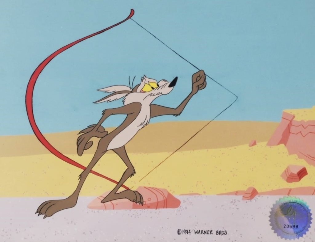
A lot of people would say that the Road Runner pictures were cruel and overly violent. I don’t agree, but they do say that.
I’ve heard the same thing, but what happened to the Coyote was that he got his comeuppance for whatever he did; everything backfired on him. It soon became understood that he was indestructible. I’m not defending the violence of the Road Runners, but I think this was the reason it was more acceptable.
The funny thing is, I imagine a lot of the people who work on these new films you’re talking about feel that they’re influenced by the Warner Bros. films you worked on.
I’ve had the opportunity to talk a number of times with groups, most recently at the Disney studios, and there’s a real hunger among these young animators and designers to really do some good work. They really want to get in there and do good animation, good stories, good gags, and so forth. But the word comes down across the walnut desk: “We have to have three pictures out this week.” So the crew works like crazy and gets their three pictures out, but they don’t stop to look back at it, because “Oh well, it’s going to be sent over to be done in the Orient, and who knows what we’re going to get back, anyway.” There’s no esprit de corps.
I think there’s a lack of personal satisfaction on the part of the people who are trying to do the creating today. They’re so remote from the final product. This is one thing that we were fortunate in with our comparatively small crew at Warner Bros.: everybody knew that we were depending on everyone else to really deliver the goods. And this resulted in a lot of these gems of cartoons. I didn’t know that we were doing that at the time, but in retrospect this is evidently what we did.
Are you surprised that the interest has continued in your work, and that people are writing books and magazine articles about what you did?
Oh, I’m constantly surprised. I meet a lot of people that know more about what I’ve done than I do. I was speaking to [Steven] Spielberg—we had met—and I told him it was an honor to meet him, and he said it was an honor to meet me, and we had a nice exchange of conversation. Somehow design came up, and I said, “I always designed stuff to please myself.” He got that kind of quizzical look on his face, and I said, “Well, you can’t really expect anyone to like something unless you like it yourself.”
This is what Chuck and our crew and I were doing: we were turning out cartoons to please ourselves. In that way we got a certain spirit to them that came across to the audience, and they joined in the fun. If you get too darn remote from a given creative project, all of a sudden it becomes sterile. I think this is what has happened in the studios today.
I really do believe that animation is a unique and wonderful artform—I hate to make it an American artform, but I really think that’s where it developed. I think it has vast possibilities; I’d like to see a museum where you could go in and sit down and see What’s Opera, Doc? or The Dot and the Line or any of the other short subjects, just as you go into a gallery and see static pictures. I think it would be very popular, and it may happen someday. People would come out of a museum laughing—wouldn’t that be great!
Maurice Noble Bonus Items
A few more pieces of Maurice-ana that are most definitely worth your time:
Maurice Noble: Four Interviews: Mike Barrier and Milton Gray interviewed Maurice four times between 1977 and 1990 for Mike’s book Hollywood Cartoons. Though conducted before my interview, these extremely meaty conversations weren’t published until much later.
Maurice Noble: Animation’s Old Rebel: A 1998 article by ASIFA-SF’s Karl Cohen.
The Noble Approach: For years, Maurice hoped to produce a book about his approach to animation design. After he died, his friend and collaborator Tod Polson turned his notes into this wonderful book, which I’m happy to say also draws on my interview. The paper version has been out of print for years and is now a high-priced collectors’ item, but you can still buy the Kindle edition.
Why “What’s Opera, Doc?” Looks Like That: The excellent newsletter Animation Obsessive recently published this making-of essay on the cartoon, and quoted from my interview.
Bob Givens and Maurice Noble—Parts 1 and 2: I am grateful to veteran cel painter Martha Sigall for hosting this conversation between Maurice and his friend and colleague Bob Givens, and to Jerry Beck for sharing it on YouTube. Watch it, and you’ll get a feel for what it was like to hang out with Maurice, and why I miss the pleasure of his company so much.
The Pumpkin of Nyefar: After Maurice died, Tod Polson saw this “Noble Tales” cartoon they’d been working on together through to the screen. I’m sure he would have been pleased with the results. And I still have the Noble Tales cap he gave me.
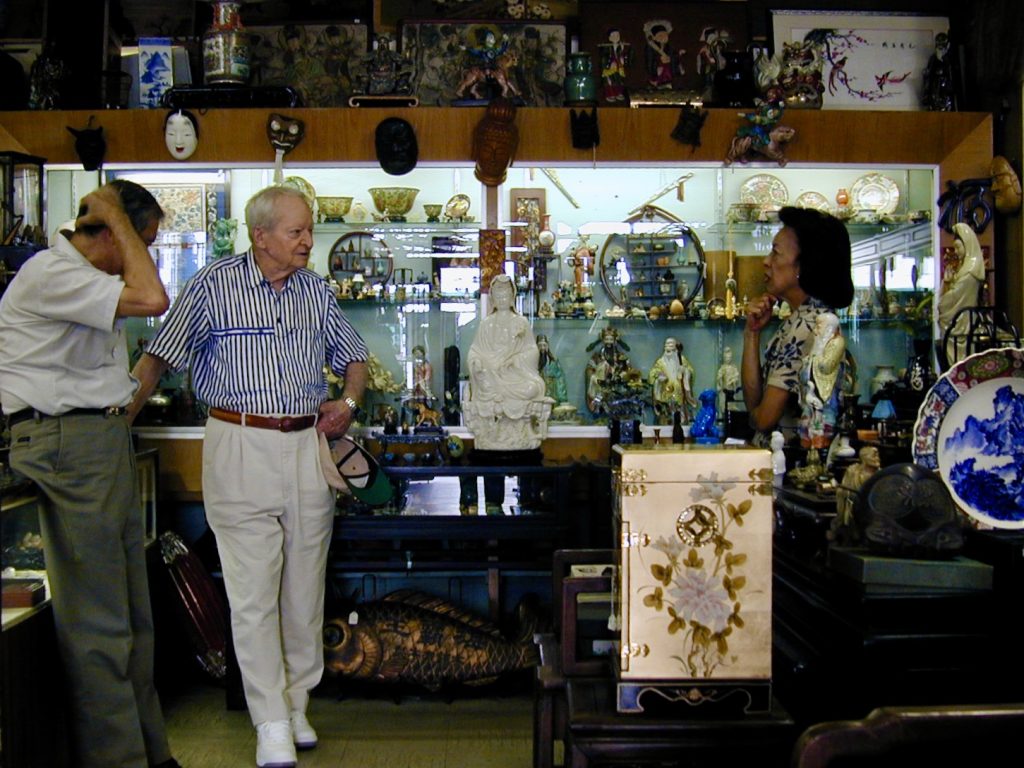
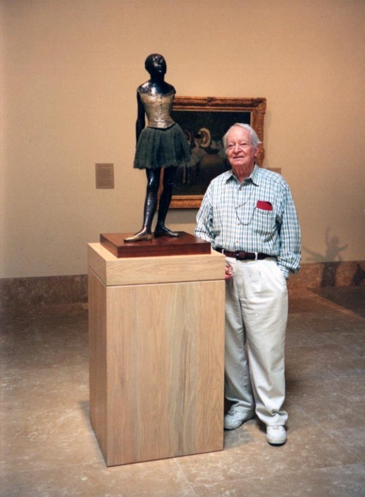
Finally, I leave you with one more photograph: Maurice in Chinatown in 2000, dapper as always, chatting with the proprietors of a curio shop he’d been patronizing for most of his life, he told me.